Krishi Kisan Android App
Compiled in an attempt to better understand the
Krishi Kisan Mobile App as a part of UI/UX Redesign Project
Problem Statement
Developer: Government of India
In order to make better accessibility of plots selected for above activities and also for proper
monitoring, it is compulsory to have geo-tagging of these plots throughout the country. In this
direction, this department has developed a mobile App (available on NFSM website) that can
be used to locate the concerned demonstration plots and farmers field location. This will help
in preparing annual-action-plan, budget allocation and proper monitoring of the scheme. It is
a step towards Digital Agriculture.
Purpose of the App
Mobile app developed to help farmers by providing relevant information to them quickly. With
the click of a button, they can get the information on demonstrations in the nearest area and
Seed Mini-kit distribution in their area.
Features
• Cluster demonstrations by state
governments
• Front Line Demonstrations (FLDs)
conducted by ICAR Institutions on rice,
wheat, pulses, coarse-cereals and nutriacereals.
• d) Mini kit-demonstrations on farmers field
• e) Seed production by seed hub centres
of pulses and nutria-cereals.
App Feedback
Here are some of the reviews that were posted by some of the users on App store
• 1. Only useful to some Agriculture office. No use at all. Waste of time.
• 2. I cant understand the purpose of app as No details of event are available.
• 3. This App Design for particular reign not for all over India so don't your time with this app.
Accessibility
• The application is accessible to anyone who owns a smartphone. It can be downloaded via
the Google Play Store and the Apple App store
• Internet connection is required to download the app but the app contents can be accessed
even without internet
• The application is only accessible the English language.
Background of Problem Space
Conducted a visual study of the app based on the following parameters: Typography, Colour Scheme, Layout, Icons & Information Chunking.
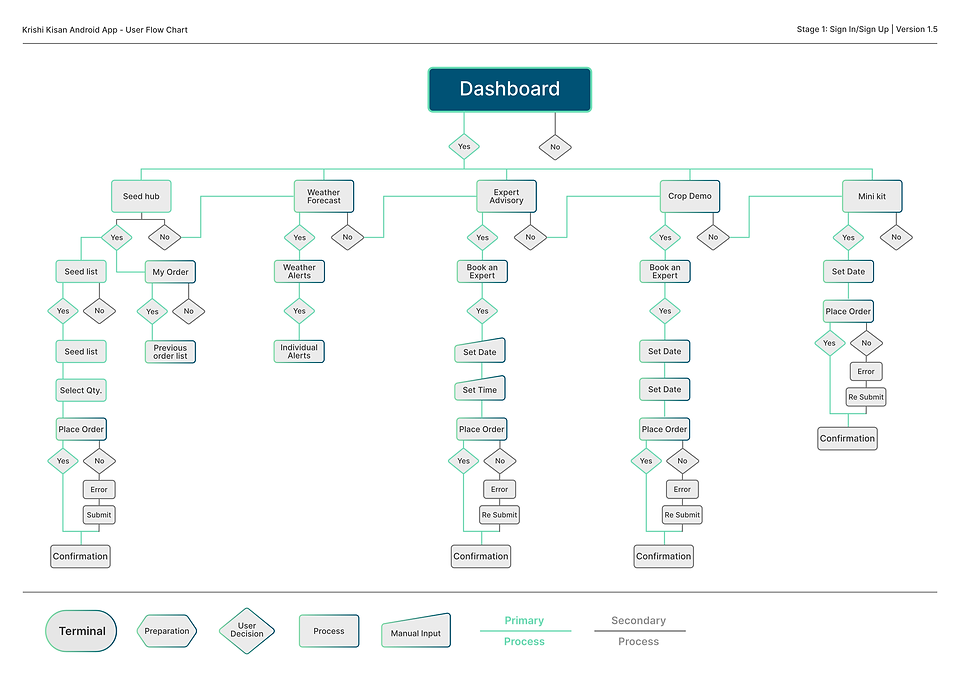
US Health Care Process Flow- Revenue cycle management

Colour Scheme
The app follows a very agriculture based green coloured colour scheme with white text. It is simple and suits the purpose.
Icons
The icons used are good visually but however it is really difficult to decipher what the icons actually mean.
Screen layout
The app follows a very cluttered and random layout wherein the options of Crop Demonstration, Mini kit distribution, seed hub and dashboard are on the opening screen and they all lead to different screens with most of them if not all of them being not functional.In the crop demonstration section one can only check upcoming crop demonstrations too if he is lucky otherwise the app just crashes back to the main screen. In the mini kit distribution option the users are only told how many total mini kits are distributed. That's all there is no option to apply for a mini kit. Dashboard takes to a login screen where each time you login you have to provide an OTP no matter what.
Information Chunking
The information chunking has been done as per categories but however the information which is chunked is irrelevant and is of littleto no use to the farmers.
Research Analysis
To understand our users better, we took part in live interview sessions with them. We interviewed six farmers from different areas, gender, growing different crops. You can find out a little more about them from the User Persona Cards that we developed for each one them.The following is a brief account of our analysis from the data we collected from this research.


Design Process
The steps of the design process and how to use them.

Paper Prototype
This is an experimental phase, and the aim is to identify the best possible solution for each of the problems

Low Fidelity Wireframes
Low fidelity wireframes give designers and programmers an idea of where images, text, buttons, and interactive elements might be placed.


Colour Scheme
for the User Interface Design of the Krishi Kisan Android App
The Krishi Kisan Mobile App for Android is a government app that primarily revolves around agricultural and farming-related issues that farmers might face in their day-to-day life. The basic premise of the app is to make available resources more accessible to farmers through a simplified and
easy-to-understand information system.
Based on this information, we decided to pursue a modern minimal colour theme, that was easy on the eyes and pleasant to the user. The colour system that we finalised, primarily revolved around a pastel colour palette, with Medium Aquamarine Green as the Primary Colour and Dark Imperial Blue as the Secondary Colour.
The Tertiary Colours are chosen as supplements to the Primary and Secondary Colours.

To make the UI easier to interpret and more interactive, we decided to go with a wide 9-variant palette for each of the Primary, Secondary and Tertiary Colours. Each color was split into 8 additional tints and shades for use.


My learning
In our attempt to successfully redesign the Krishi Kisan Mobile App, originally created to help farmers streamline the process of farming, we tried to find out various problems. To look beyond the problems that existed in the current app, we studied the competitor apps to understand why, what and how they were designed. We tried to understand what the customers exactly wanted, and whether or not these particular apps served the given purpose, only to help improve our own app’s design.